Introduction
Corporate teams face a genuine communication crisis. The average Microsoft 365 worker receives 117 emails and 153 Teams messages every weekday, and Gartner reports that 38% of managers feel overwhelmed by the volume. Against that backdrop, text-based content simply doesn't cut through.
Video cuts through where text can't. According to Brightcove and Ascend2's B2B buyer research, 83% of B2B buyers prefer product tours via video over written formats, and 95% say video is important to moving forward with a purchase.
The evidence for animated explainers is clear. The harder question is what "good" actually looks like — across industries, animation styles, and specific communication goals — and how to build something that performs.
This article covers 20 real-world corporate animated explainer video examples grouped by use case: enterprise tech, customer onboarding, internal training, financial services, and healthcare/nonprofit/government. For each example, we explain what the video does well and why it works — so you can apply those lessons to your own projects.
Key Takeaways
- 83% of B2B buyers prefer video over written formats for complex product explanations
- The 20 examples cover five categories — from enterprise tech and financial services to healthcare, government, and internal training
- The strongest corporate explainers lead with audience needs, then build narrative structure and visual consistency around them
- Animation style (2D, 3D, motion graphics, hybrid) should follow your audience and message — not trend
- The right production partner shapes your message before a single frame is drawn
What Makes a Great Corporate Animated Explainer Video
The best corporate explainer videos do one thing well: move a specific audience toward one outcome. That might be a purchase decision, a sign-up, a behavior change, or understanding a complex process. Everything else — style, motion, music — serves that goal.
Narrative Structure That Works
The most reliable arc for corporate video is straightforward:
- Problem — establish the pain point your audience recognizes
- Solution — introduce the answer without over-explaining
- How It Works — show the mechanism in concrete, visual terms
- Call to Action — tell viewers exactly what to do next
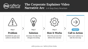
This structure works even for dry subject matter because it mirrors how decisions are actually made. It also keeps pacing tight. Vidyard's 2024 business video benchmark found that videos under one minute retain 65% of viewers to the end, while videos over 20 minutes retain just 20%. Pacing directly determines whether your message lands or gets abandoned.
Visual Consistency Signals Credibility
For enterprise buyers, visual inconsistency registers as unprofessionalism. Corporate explainer videos need to:
- Align with established brand guidelines (colors, typography, iconography)
- Feel cohesive across a library of content, not just as a standalone piece
- Match the production quality expected in the sales or procurement context
Tone Varies by Audience
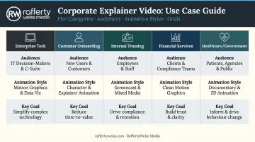
Audience context shapes every creative decision. The right tone for one viewer can alienate another entirely:
- Government and federal agencies — measured, authoritative, precise language
- Enterprise B2B buyers — professional, evidence-based, low on hype
- SaaS and startup teams — energetic, direct, personality-forward
- Healthcare and nonprofit audiences — empathetic, clear, trust-building
Misreading the room doesn't just feel off — it signals that the producer didn't understand the audience, which undercuts credibility before a single message lands. The examples below show how leading organizations calibrate tone alongside structure and visual style.
20 Corporate Animated Explainer Video Examples
These examples are grouped into five corporate use case categories. Each has distinct goals, audiences, and animation approaches. Use the groupings to quickly find what's most relevant to your own project.
Enterprise Tech and SaaS Platform Overviews
1. Microsoft Azure Azure's 2D motion graphics explainer uses minimalist animation — network diagrams, server icons, deployment timelines — to make a complex cloud platform accessible to non-technical buyers. The key decision: it avoids jargon without dumbing down the content. Decision-makers who aren't engineers can follow the narrative; technical buyers still find the specifics they need.
2. Monday.com This demo-style video shows the product in action from the first second. It lists specific user personas upfront — marketing teams, project managers, operations leads — which immediately tells viewers "this is for someone like me." The voiceover is punchy and direct, positioning the platform as a single system that handles cross-organizational complexity.
3. Slack The famous "So Yeah, We Tried Slack" video used a mockumentary live-action/animation hybrid to dramatize the pain of outdated email communication, then transitioned to animated metaphors — inboxes becoming threads, scattered documents unifying — to show Slack's value in under two minutes.
Production studio Thinkmojo rebuilt the Slack interface in animation software rather than screencasting, giving them precise control over what viewers saw and when. The result: hundreds of thousands of plays with strong retention.
4. Gong Gong's product overview syncs voiceover tightly with on-screen illustrations in a show-and-tell format. Review badges and award callouts appear at strategic moments, providing social proof without interrupting the narrative flow. Bright, branded visuals hold attention through what is genuinely complex sales intelligence content.
Customer Onboarding and Education
5. Dropbox The original Common Craft explainer video for Dropbox (2009) used simple stick-figure animation and a jargon-free, conversational script to make cloud file storage — an entirely unfamiliar concept at the time — approachable for mainstream audiences. By 2012, according to Dropbox, the video had accumulated well over 25 million views. It remains the benchmark for explaining a novel concept to a non-technical audience.
6. Grammarly Rather than demonstrating features, Grammarly's explainer follows two characters co-writing a proposal, with the tool appearing as a supportive presence throughout. The emotional narrative makes a functional product memorable.
Grammarly's broader video marketing strategy has driven measurable results — a separate Microsoft Advertising campaign produced a 73% conversion lift and 42% search lift — underscoring how video-first content strategy compounds over time.
7. Calendly Calendly's product explainer opens with a relatable pain point: time wasted on back-and-forth scheduling emails. It uses step-by-step walkthroughs with live narration and proactively addresses viewer objections before they surface. Produce Media used motion graphics and color correction to keep a longer format engaging throughout.
8. Uber Eats (Driver Training) Explainly has produced 15+ videos for Uber Eats' B2B marketing team since 2022, combining 3D elements with 2D hand-drawn cel animation.
The driver-facing content blends real-world footage with animated UI callouts and step-by-step pop-ups, solving a genuine corporate onboarding challenge: training new couriers at scale across multiple markets without in-person sessions.
Internal Communications and Employee Training
9. Booking.com (Internal Tools) Booking.com's Mission: Impossible-inspired motion graphics video guides employees through a new internal meeting platform. The use of humor and cinematic references transforms what would typically be a dry software walkthrough into content people actually choose to watch. Tone matters as much as information when the audience is internal.
10. FlexU by Flexport This 17-part series combined live expert talks with custom animated overlays to help employees navigate complex logistics concepts.
The hybrid format works because credibility comes from the live expert presence, while animation handles the explanatory heavy lifting — illustrating supply chain flows, data models, and processes that would be impossible to demonstrate with talking heads alone.
11. Amazon Go Amazon Go's launch video used real-world footage with subtle on-screen text prompts ("Swipe in," "Receipt sent to app") to demonstrate a brand-new retail concept. The restraint is deliberate: live footage builds trust in the physical reality of the store, while text animations clarify the tech layer without overwhelming the experience.
12. Databox Databox's tutorial-style explainer pairs a voiceover guiding viewers step by step through setup with product screenshots and simple illustrations. That dual function — onboarding tool and sales resource — is a real advantage. Well-made internal training content often doubles as external proof of a product's ease of use.
Financial Services and Professional Services
13. Mastercard Mastercard's 2D animation blends minimalist visuals, crisp typography, and global statistics to position the brand as always-on infrastructure. There's no heavy product demonstration — just confident, visually consistent storytelling that builds institutional trust. For a brand operating at global scale, that restraint is the right creative call.
14. Visa (Threat Intelligence) Visa's cybersecurity explainer uses a spy-thriller aesthetic — sharp sound design, animated data visualizations, fast cuts — to turn cybersecurity jargon into an actionable narrative. The style choice is deliberate: B2B decision-makers evaluating security partnerships need to feel urgency, not read a whitepaper.
15. J.P. Morgan (3PM Series) J.P. Morgan's video series uses motion graphics to surface key data while live footage anchors the content. This is a good example of knowing when not to animate. When credibility requires real human presence — a senior analyst, an executive voice — over-animation undercuts authority. Motion graphics enhance without replacing.
16. Jaggaer (Autonomous Commerce) Synima produced a 3D animated explainer for Jaggaer's Autonomous Commerce platform using a minimalist block motif traveling a continuous linear path. The single-shot visual metaphor communicates procurement flow clearly and establishes Jaggaer's authority in enterprise e-commerce.
The video also doubled as a brand storytelling asset on social media — a natural second life for well-executed 3D explainers with strong visual identity.
Healthcare, Non-Profit, and Government Communications
17. CAMHS (Child Mental Health Services) This 2D animated explainer used accessible visual metaphors and simple character design to help families — including children — navigate mental health services. Live-action would have failed this audience: it risks feeling clinical or intimidating. Written materials aren't accessible to children or those with low literacy. Animation solved both problems and achieved reach across all UK branches of the service.
18. UCL ADHD Awareness UCL's ADHD awareness video used a 2.5D lighting effect on character animation to strike the balance between engagement and seriousness. For sensitive healthcare topics, this middle ground matters. Too playful trivializes the subject; too clinical loses the viewer. This example is a model for government and nonprofit communicators working with complex, emotionally sensitive content.
19. Duolingo Duolingo's animated explainer — featuring the brand's owl mascot, gamified visuals, and humor — makes learning onboarding feel rewarding rather than obligatory.
The lesson for corporate communicators: personality-driven animation drives adoption. Any organization trying to change behavior through video (compliance training, health programs, new tool rollouts) can apply this directly.
20. Clever Devices (Transit Technology) Clever Devices' B2B animation combines live-action dispatcher footage with animated real-time data overlays to show how transit agencies modernize operations.
This is a strong reference for government-sector explainers: the live footage establishes operational credibility, while animation explains the technology layer that decision-makers need to understand before approving procurement.
Animation Styles Used in Corporate Explainer Videos
The Three Core Formats
| Style | Best For | Examples From This List |
|---|---|---|
| 2D Animation | Corporate, government, training, character-driven stories | CAMHS, Dropbox, Mastercard |
| Motion Graphics | Data-heavy, process-driven, financial content | Visa, J.P. Morgan, Calendly |
| 3D Animation/CGI | Product visualization, premium brand positioning | Jaggaer, Uber Eats |
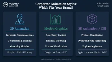
Wyzowl's 2023 State of Video Marketing report found that **55% of video marketers created animated video** — making animation a mainstream corporate format, not a niche choice.
When Hybrid Approaches Work Best
Live-action combined with animated overlays works when audiences need to see a real person to trust the message, but the concept still needs visual explanation. Three examples from this list illustrate why:
- Grammarly — real characters establish emotional connection; animation handles feature explanation
- J.P. Morgan — live analyst presence carries authority; motion graphics surface the data
- FlexU — live expert talks provide credibility; animated overlays explain complex logistics concepts
Animation style should match your audience, not the current trend. A compliance video for a federal agency calls for different visual language than a SaaS onboarding explainer — and getting that wrong undermines both clarity and credibility.
How We Selected These 20 Examples
Examples were chosen based on four criteria:
- Clarity of corporate messaging — does the video communicate a specific idea to a specific audience?
- Fit between animation style and use case — does the format serve the message, or fight it?
- Audience-appropriateness — is the tone, complexity, and visual approach right for the viewer?
- Documented outcomes or reach — where verifiable, we've included engagement, views, or awards rather than unverified conversion claims
One common mistake when reviewing explainer video examples: choosing a style because it looks impressive, not because it fits the message. A cinematic 3D production might look premium, but if your audience is frontline employees watching on a work tablet during onboarding, that spend doesn't translate into better outcomes.
The right benchmark isn't production value — it's whether the format works for the specific viewer, device, and context where the video will actually be watched.
Conclusion
The best corporate animated explainer videos succeed because of strategic clarity, not production budget. Every example in this list works because someone defined the audience, identified the communication goal, and chose an animation style to match — before production began.
Use these 20 examples as a starting point for your creative brief. Identify which use case category matches your challenge, which animation style fits your audience, and what a successful outcome looks like for your organization.
RaffertyWeiss Media has over 25 years of experience producing animated explainers, motion graphics, eLearning modules, and hybrid video content for clients including Lockheed Martin, AARP, the Department of Labor, Fannie Mae, and the American Red Cross. If you're ready to move from reference examples to a production plan, reach out to discuss your project.
Frequently Asked Questions
How long should a corporate animated explainer video be?
Most corporate explainer videos perform best at 60–90 seconds for external sales and marketing use. Internal training videos or multi-part series can run longer without the same drop-off risk. Length should be determined by message complexity and viewer context — a compliance module watched at a desk can hold attention longer than a sales explainer embedded in an email.
What animation style is best for a corporate explainer video?
2D animation suits most corporate and government contexts; motion graphics excel for data-heavy financial or process-driven content; 3D works well for product visualization or premium brand positioning. Start with your audience and message, then choose the format that serves both.
How much does a corporate animated explainer video cost?
According to Wyzowl's 2024 cost study of 116 production company quotes, the outlier-adjusted average for a one-minute animated explainer is $8,457, with quotes ranging from $600 to $250,000 depending on complexity and style. Motion graphics typically cost less than full 3D production. Length, revision rounds, and voiceover requirements all affect the final price.
What should I include in a brief for a corporate animated explainer video?
A strong brief covers:
- Target audience and their primary pain point
- Desired tone and distribution channel
- The one key message and call to action
- Brand guidelines (colors, fonts, logo usage)
- What success looks like — views, conversions, training completions, or otherwise
How do you measure the success of a corporate animated explainer video?
Key metrics include view-through rate, click-through or conversion rate, and engagement signals like shares and comments. For training content, track completion rates. For sales assets, measure downstream impact: demo requests, pipeline influence, or sales cycle length.
Can animated explainer videos work for government and non-profit organizations?
Yes. Animation is particularly effective for public-sector communications because it's accessible, works across literacy levels, and can simplify complex policy or service information for diverse audiences. Public health research confirms animated messages support knowledge retention and behavior change — and examples like CAMHS and UCL ADHD Awareness in this list demonstrate the format working in practice for government and healthcare contexts.